# Create Awesome Toasts With react-toastify
👋 Hey All,
In this article, I'm going to show you how to create really simple and cool toasts using the `react-toastify` package.
Lets get right into it!
# What Are Toasts?
Firstly, lets clarify what exactly is a 'toast':
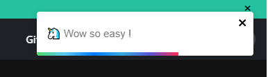
A toast is a little pop-up that can positioned anywhere on the screen that shows a text message to the user. For example, toasts can be used for error messages, success messages or even notifications.
A toast may look like this:
# Where does react-toastify fit in?
`react-toastify` is a cool package I came across recently that lets you easily implements customizable toasts into your react applications. With just two lines of code, you can get a working, responsive toast that can be customized.
After reading this article, you can check out their full documentation [here](https://fkhadra.github.io/react-toastify/introduction) to see everything you can build with react-toastify.
# Installation
To install react-toastify, simply run:
```
npm install --save react-toastify
```
or with yarn:
```
yarn add react-toastify
```
# Your First Toast
To create your first toast, import the `ToastContainer` component and `toast` function:
```
import { ToastContainer, toast } from "react-toastify"
```
You also need to import their CSS file:
**Regular Version**
```
import 'react-toastify/dist/ReactToastify.css';
```
**Minified version**
```
import 'react-toastify/dist/ReactToastify.min.css';
```
Finally, you can place the `` component anywhere in your JSX and call the `toast('Message to be shown')` function to show the toast.
For example:
```javascript
import React from 'react';
import { ToastContainer, toast } from 'react-toastify';
import 'react-toastify/dist/ReactToastify.css';
const App = () => {
const handleClick = () => {
toast("This Is A Toast!");
}
return (
);
}
```
Pretty cool right? What makes this package even better is that you can customize the toast by passing certain optional props to the `ToastContainer` component.
Some options include:
- `position`: which controls where the toast is positioned. Possible values include: `top-left`, `top-right`, `top-center`, `bottom-left`, `bottom-right`, and `bottom-center`.
- `autoClose`: which controls how many milliseconds until the toast automatically closes. E.g `autoClose={5000}` for it to last 5 seconds.
- `closesOnClick`: which controls whether the toast will close when its clicked on. It's value is a boolean of either `true` or `false`.
- `theme`: which controls the theme of the toast. This can be either `light`, `dark` or `colored`.
- More options in `react-toastify`'s documentation: [docs](https://fkhadra.github.io/react-toastify/introduction)
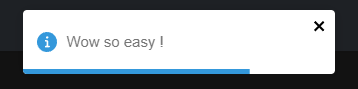
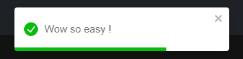
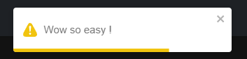
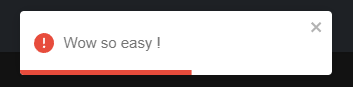
Additionally, there are 5 different types of toasts you can use including: `info`, `success`, `warning`, `error` and default. These just change the color of the toast as well as the icon displayed.
Different types in action:
**Info**
```javascript
toast.info("Wow so easy !")
```
**Success**
```javascript
toast.success("Wow so easy !")
```
**Warning**
```javascript
toast.warn("Wow so easy !")
```
**Error**
```javascript
toast.error("Wow so easy !")
```
**Default**
```javascript
toast("Wow so easy !")
```
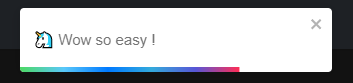
> Note: Changing the `theme` option will change the appearance from these images
# Take Away
In This article, you have learned how to implements toasts in your react applications with the `react-toastify` library. This can be used in a wide range of scenarios such as displaying error messages and presenting warnings to a user. Recently, I used this package in a cool social network project for the Netlify X Hashnode hackathon: check it out [here](https://blog.blakeyeboah.com/introducing-code-network-a-social-network) if interested.
👌 Thanks for reading this article!
If you like what I do and would love to see more related content, follow me on my other social platforms:
**GitHub:** [Blake-K-Yeboah](https://github.com/Blake-K-Yeboah)
**LinkedIn:** [Blake Yeboah](https://www.linkedin.com/in/blake-yeboah/)
**Twitter:** [Blake Yeboah](https://twitter.com/BlakeYeboah)
You can also show your support by buying me a coffee 😃